

Last week, researching information about UK house price affordability, EYE came across an analysis piece written by Duncan Lamont CFA, the Head of Strategic Research at Schroders. It made interesting reading and is an extremely useful and clear picture of the history of how we arrived at the present-day market conditions.
It was written in March 2021 when the the earnings to average house price multiplier had just broached the 8x level for only second time in the modern era. Last week it hit 8.7x.
Schroders has kindly given us permission to reproduce the article in full.
What we’ve learned from nearly 200 years of housing data – and is property really a better investment than a pension?
By Duncan Lamont CFA, the Head of Strategic Research at Schroders
We dug into the treasure trove that is the Bank of England’s Millennium of data resource to analyse the history of house prices. We found that the average house in the UK currently costs more than eight-times average earnings, based on data as at 31 December 2020.
Before the current episode, this eight-times-earnings level has only been breached twice previously in the past 120 years – once just prior to the start of the financial crisis and once around the start of the 20th century.
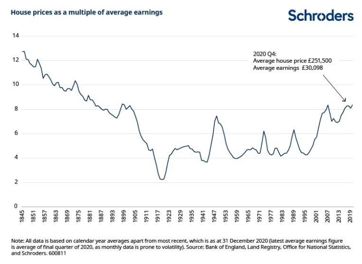
It may only be of historic curiosity, but it is interesting that house prices were even more expensive in the latter half of the nineteenth century. They then went on a multi-decade downtrend relative to earnings. This only bottomed out after World War I. There are three important drivers of this: more houses, smaller houses, and rising incomes.
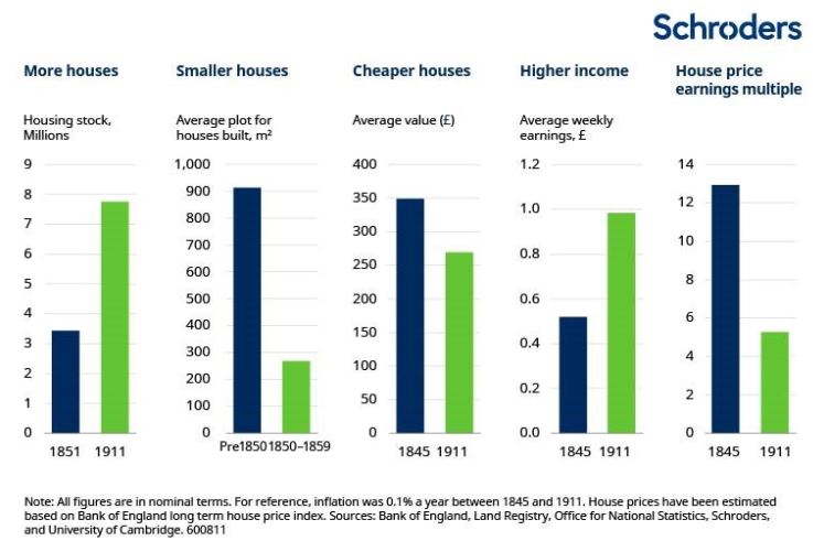
More houses: There was a more than doubling in the stock of housing in England, Wales and Scotland between 1851 and 1911. It rose from 3.8 million to 8.9 million houses – for reference, today it stands at more than 28 million.
Smaller houses: Houses built before 1850 were significantly larger than those built after. Prior to 1850, the average house in England and Wales had a plot size of 913 square metres but houses built in the next 50 years had an average plot size of only 268 square metres[1]. This reflected both a shift in construction towards smaller types of housing (e.g. a shift away from detached houses towards terraces) and a downshift in the average size of houses within each category. For example, the average plot size for a pre-1850 terrace was 278 square metres but that fell to 147 square metres for those built between 1850 and 1899.
Higher incomes: While average house prices fell by 23% between 1845 and 1911 (-0.4% a year), due in part to the two factors above, earnings rose by 90% over the same period (+1.1% a year).
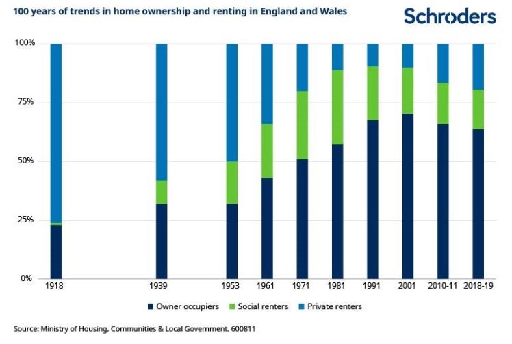
So this was a great time for UK homebuyers? Not really. The UK was a nation of renters back then. Even in 1918, over three quarters of people rented their home (data based on England and Wales, but this is likely to be representative of the UK). It was not until the second half of the 20th century that the cult of home ownership really took off. Rates of home ownership rose steadily in the intervening decades, peaking at over 70% in the early 2000s.
However, as house prices have risen from around four-times average earnings in the mid 1990s to more than eight-times more recently, affordability has deteriorated dramatically for first-time buyers (most mortgage providers apply constraints on the amount they will lend as a multiple of earnings). This has contributed to home ownership rates falling to 62-64% in the past five years, levels last seen in the early 1980s.
Returning to homebuilding, it all but ceased entirely during World War I for obvious reasons. However, once the war was over, it picked up in the 1920s, before a construction boom took place in the 1930s. More than 2.7 million homes were built in this decade, with more than 2 million being built by the private sector alone. Interest rates being anchored at 2% and abundant land and labour all helped.
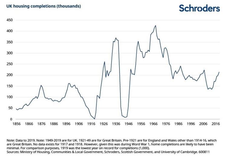
House building also took off after the second world war – a necessity as large parts of the nation’s housing stock had been destroyed during the war. However, in contrast to the 1930s when the private sector took the lead, it was the public sector which picked up the mantle in the 1950s, 60s and 70s (this was also peak time for slum clearances – an average of around 67,000 homes a year were demolished or closed down between 1955 and 1980, peaking at 95,000 in 1971). In turn, the private sector has been the dominant house builder for the past 30 years.

Regional variations in affordability
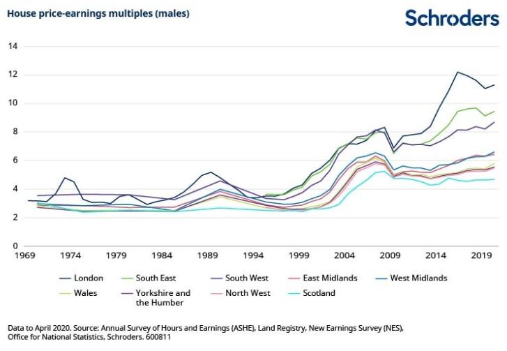
Returning closer to the present, disparities in affordability exist between regions and the sexes. As could have been anticipated, long-term regional data is not quite as abundant as nationwide data but we are able to track house price-earnings multiples back to 1969. This is shown for males below. A comparison with females follows (earlier data is only available for males and females separately).
The shift in affordability between London and other parts of the UK stands out. The average London house would cost over 11-times the average London wage. Properties in the south east and south west are also expensive but this is likely to be influenced by commuters who live in those regions but work in London, earning London wages (which are higher). The popularity of second homes in Devon and Cornwall is also likely to be a factor.
Things get more affordable as you move further north. The Midlands cluster around 6.5-times average earnings, while the North West and Yorkshire, alongside Wales, are on around 5.5 to 6-times.
In Scotland, the average house costs around 4.7-times average earnings, the lowest of the major British regions. Readers may be surprised to learn that this regional divergence is a relatively recent phenomenon. In the three decades prior to the mid-1990s, there was relatively little difference between different parts of the country.
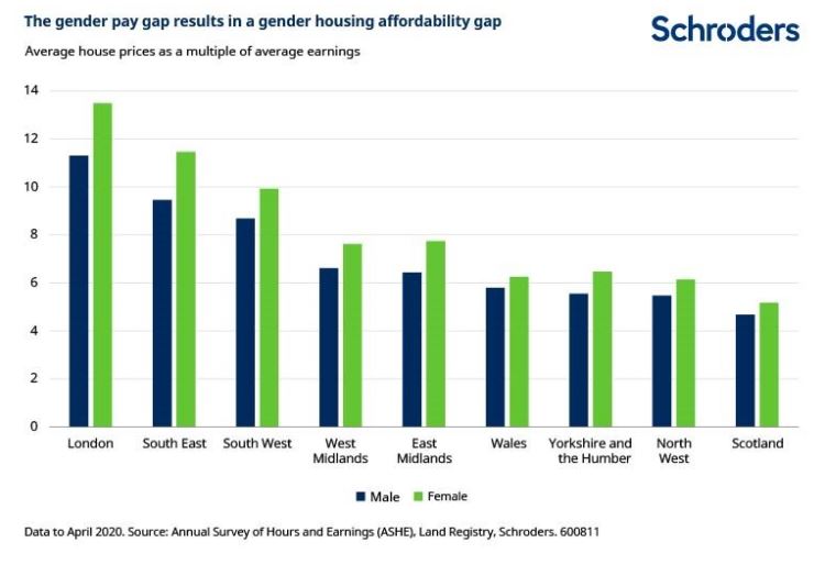
Houses are less affordable for women than men
Sadly, thanks to the gender pay gap, things look even worse for women. The average house in London would cost over 13-times the average woman’s salary, compared with 11-times for a man. This housing pay-gap holds across all regions.
Conclusions
How might affordability improve?
Houses have rarely been more expensive relative to earnings than they are today in more than 120 years. Prices are stretched everywhere but London and the south of England stand out. Things look even less affordable for women.
The last time there was a sustained decline in the house price-earnings multiple was the second half of the 19th century. Average house prices fell for more than 50 years thanks to substantial building of houses, many of which were smaller than existed before. At the same time earnings rose.
How likely or even desirable would that be today? The UK’s heavily mortgaged consumers would struggle to cope with 50 years of falling house prices. It would also be political suicide for whoever was deemed responsible. A shift towards the building of smaller houses would also seem unlikely – research has found that houses are smaller today than at any point since at least the 1930s[1]. Hobbit homes cannot be ruled out entirely but I’m not sure how positive an outcome that would be.
Which leaves us with earnings. Earnings growth has been weak since the financial crisis but has recently picked up strongly – average earnings in the final quarter of 2020 were 4.7% higher than the same period of 2019. A period of stronger pay growth may represent the best hope of improving affordability (with the caveat that stronger earnings may result from a stronger economy which could result in a stronger housing market).
The elephant in the room here is interest rates. A Bank of England working paper[2] concluded that nearly all of the rise in average house prices relative to incomes between 1985 and 2018 can be seen as a result of “a sustained, dramatic, and consistently unexpected, decline in real interest rates as measured by the yield on medium-term index-linked gilts”[3]. The Bank doesn’t rule out other factors, but concludes that they have had more of a short term impact. It furthermore concludes that: “An unexpected and persistent increase in the medium-term real interest rate of 1 percentage point from its level as at end 2018 could ultimately generate a fall in real house prices (over a period of many years) of just under 20%.”
However, depending on whether you are a current home owner or a prospective buyer, you are likely to be encouraged and discouraged in equal measure by the Bank of England’s scepticism that this is likely to materialise. Just because house prices are expensive relative to earnings does not mean there is a good reason to expect them to cheapen materially.
Is property a better pension investment than shares?
A bigger shadow is the faith that many Brits put in property as their pension. Anyone who has read the Money section of a Sunday newspaper will be familiar with the question regularly posed to celebrity interviewees: Which is better, property or pension? In all but a tiny minority of cases, the answer comes back “property”.
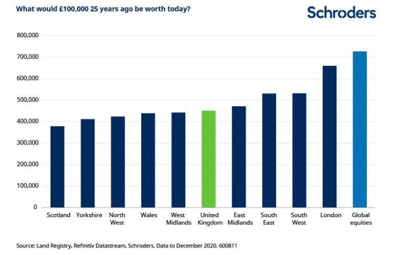
House prices have tended to rise over time, so it is not hard to understand why people say this. £100,000 worth of UK property 25 years ago would be worth an average of around £451,000 today. This obviously varies by region. In London it would be worth around £660,000 and in Scotland, £378,000. These figures exclude any costs of ownership such as maintenance, repairs, insurance or taxes; any income generated by the property (not relevant for primary residence, only buy-to-let); and the impact of leverage/mortgage finance.
However, that same £100,000 invested in the global stock market (again, excluding any costs) would have grown even more, to around £727,000. This is 10% more than in even the best performing regional property market, London. Furthermore, it doesn’t matter whether you look at this over 5, 10, 15, 20, 25 or 30 year horizons. The stock market would always have resulted in a bigger increase in your £100,000 compared with UK residential property.
This also does not take into any account the substantial tax savings which can be earned by saving into a pension nor the substantial taxes and costs associated with buying and selling property.
So the next time you think about which is better, property or pension, think carefully before you answer.
The article first appeared in March 2021: https://www.schroders.com/en/uk/adviser/insights/markets/what-174-years-of-data-tell-us-about-house-price-affordability-in-the-uk/
The ‘Unaffordablity’ Index? Average house price now 8.7 times average income – ONS data

I have read many of these property v stock market articles over the years. The dynamics of home buying are never factored in. You need a place to live you do not need BT shares.
I have never seen a company that does not sell property ever come down on the side of property. Strange that these guys would advise balanced portfolios but don’t sell property, one of the best performing asset classes in history.
Added to that you will not lose the value of your property overnight because someone upset the markets and so we also have a risk reward factor to consider.
Not that balanced after all.
You must be logged in to like or dislike this comments.
Click to login
Don't have an account? Click here to register
What the article also fails to account for is that with buy to let, you would only put in 25% or so of the value of the property as a deposit. Therefore the return on your investment is 4x what is stated in the article, which blows away the stock market completely.
You must be logged in to like or dislike this comments.
Click to login
Don't have an account? Click here to register
The tax implications are very different too. You can hold shares in an ISA but can’t with property. You can bed and breakfast shares in order to make use of capital gains allowances or offset a gain/loss against the opposite. With property it isn’t really feasible to do so. You could also invest in EIS/SEIS/VCT which have significant tax benefits but there isn’t a comparable with property.
You must be logged in to like or dislike this comments.
Click to login
Don't have an account? Click here to register
The study looks at earnings, house size, affordability and housing completions. It does not appear to refer to population growth or household size and surely any sensible analysis of affordability should also refer to the size of the housing market that these elements affect ?
The effect of an increasing number of smaller households over the last 60 years has had a material effect on the additional number of homes required even if there is a “static” population; it’s simple arithmetic.
A census in 1851 suggested there were c. 17.9 million living in England and Wales, just over 50 million less than in the UK now. If housing demand exceeds supply, as it has for generations, affordability is bound to be affected as prices respond to demand.
I feel the study, or this excerpt, does not address how limited supply has affected affordability in this way.
You must be logged in to like or dislike this comments.
Click to login
Don't have an account? Click here to register
Feudal.
You must be logged in to like or dislike this comments.
Click to login
Don't have an account? Click here to register