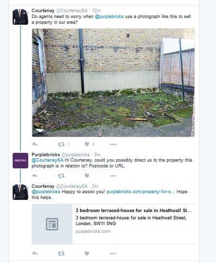
Here’s our Picture of the Week, which comes courtesy of Twitter.
Which agents, asked CourtneyEA, need to worry about Purplebricks when it uses photographs like this?
The picture certainly looks more like a project for Groundforce or possibly a prison exercise yard than a property’s finest feature.
However, as you can see from the tweets, the criticism was picked up by Purplebricks.
It will be interesting to see whether the al fresco has now disappeared!


So many poor photos. Absolute laziness and lack of pride in your job and you call yourselves property experts.
You must be logged in to like or dislike this comments.
Click to login
Don't have an account? Click here to register
according to yesterdays article more and more estate agents are wanting jobs in the online sector.
At least we’ve all got nothing to worry about if this is the standard of agents they pick up. 🙂
You must be logged in to like or dislike this comments.
Click to login
Don't have an account? Click here to register
Pay peanuts get monkeys.
You must be logged in to like or dislike this comments.
Click to login
Don't have an account? Click here to register
One only hopes that, despite the publicity we all give it, they don’t catch on and remedy this. All the while this remains the case, mainstream estate agents are better able to differentiate themselves.
You must be logged in to like or dislike this comments.
Click to login
Don't have an account? Click here to register
Hilarious that the photo still hasn’t been removed.
You must be logged in to like or dislike this comments.
Click to login
Don't have an account? Click here to register
What do you want? The Hanging Gardens of Babylon? I agree their photos rarely make the grade but to not show the ‘garden’ would be doing the vendor a disservice if outside space is at a premium in their area and therefore a key selling point. Any excuse for a bit of on-line agent bashing.
You must be logged in to like or dislike this comments.
Click to login
Don't have an account? Click here to register
Fair piont, but I actually think the internals are worse.
You must be logged in to like or dislike this comments.
Click to login
Don't have an account? Click here to register
But you can probably take a more inspiring angle (corner to corner, not straight on).
You can also use editing software to enhance the picture (this is free).
Its just lazy pictures, somebody going through the motions as opposed to really marketing a property.
You must be logged in to like or dislike this comments.
Click to login
Don't have an account? Click here to register
Don’t mock, think of the potential; as an obvious blank canvass for urban art with a modest Banksy that could be worth a small fortune.
You must be logged in to like or dislike this comments.
Click to login
Don't have an account? Click here to register