Rightmove’s rebrand is on target to start its live roll-out tomorrow.
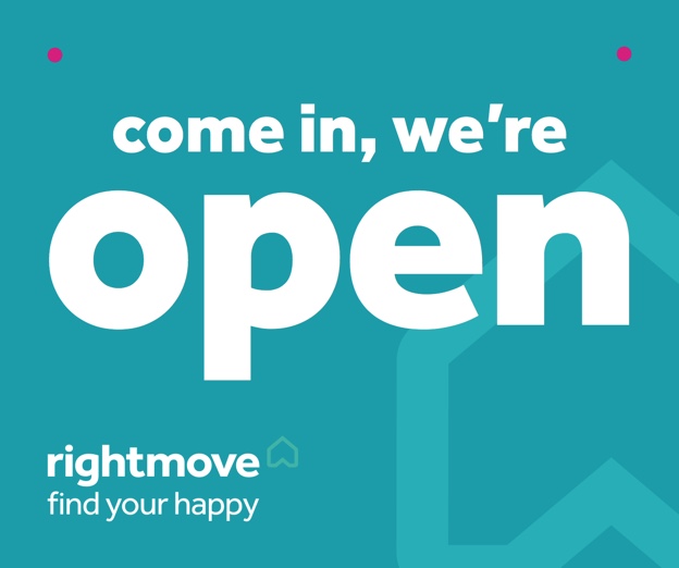
To you and me, it might be a bit of an update on Rightmove’s long-running ‘find your happy’ campaign, chiefly involving new window stickers, some updated logos and a change of colours. Oh, and some doodles coming up next.
But then, what do we know?
According to the magazine Design Week, it’s a whole new brand, “designed to symbolise the brand message ‘find your happy’ by giving it a sense of direction and ‘humanity’”.
Rightmove itself was a bit more down to earth, when we inquired, saying there has been good feedback from agents, and that the aim is to have a cleaner and bolder look.
According to Design Week, reporting on the work undertaken by a firm called The Team, it’s not nearly that simple (ie, it wasn’t cheap, involved endless creative brain-storming sessions, and will win awards).
The magazine reports: “Property search giant Rightmove has been rebranded by The Team in an effort to humanise the brand and reaffirm its position as the UK’s most popular property website.
“Rightmove claims to advertise around 90% of all homes advertised by estate agents across the UK. Started in 1999, the company set out to ‘help people make the right move’, changing their focus to ‘find your happy’.
“Rightmove’s original logo featured an arrow and a house, which had partly evolved to tell the story of finding a happy home.
“The Team’s brand strategy director Dan Dufour says that the “find your happy” message “was not being reflected in the visual identity so we had to find a way to further bring it to life.
“The Team was asked to create a new symbol and a design framework, which would work on and offline – including consumer and business-to-business marketing.
“A new logo has been designed to inject “human warmth” into the brand. Dufour says: “The best brands always engage on an emotional level and have a distinctive emotional quality.”
According to Dufour the new design is inspired by the sentiment “home is where the heart is”. The “find your happy” message is propagated by rotating the house symbol, giving it a sense of movement and direction.
“By softening the edges of both the symbol and the wordmark the brand starts to function in a “more emotional and less rational way”. It sets a precedent for a wider brand framework, which will roll out in the New Year and include a set of doodles designed in house.
“While the logo has to work in 2D in its simplest form that doesn’t mean it can’t come to life,” adds Dufour.
“A new colour palette moves away from a conservative blue and green, replacing it with turquoise, a brighter blue and a cherry red where the home symbol is made to look like a heart. The wordmark has been softened and is now set in Effra.”
Crikey! No wonder we could never find a job in marketing.
Still, it really does all look very good. And it probably will win awards.
https://www.designweek.co.uk/issues/5-11-december-2016/team-looks-humanise-rightmove-rebrand/


I think it’s a very well considered bit of re branding. Very up to date.
one thing. Hate the strap line find OUR properties on Rightmove. Sounds like Rightmove is selling its own stuff.
You must be logged in to like or dislike this comments.
Click to login
Don't have an account? Click here to register
Agreed about the strap line…..trying to give a subliminal message perhaps?
You must be logged in to like or dislike this comments.
Click to login
Don't have an account? Click here to register
Sounds like a load of PR speak to me, or ******** as I call it.
You must be logged in to like or dislike this comments.
Click to login
Don't have an account? Click here to register
How priceless…an inspired brand and marketing agency who no doubt sat down with a focus group to create a new name for their agency..so invited the Focus Group to give them a new name.
Later that day in the boardroom they were heard to say ‘We are sitting here around a table, so lets call ourselves The Team as we are one! Loud cheers were heard! Let’s go and see Rightmove. Great, lets tell them that to make find your happy more human…in a digital world, lets re design their little arrow to look like an odd shaped heart…but don’t tell them that we did the same with our own website home page with colour widgets that have a nice smile. Quick invoice before they notice’!!! Haha Rightmove!!! Have a look at The Team .co .uk site
Hope this amuses my fellow cynics and satirists.
You must be logged in to like or dislike this comments.
Click to login
Don't have an account? Click here to register